Do you know how to create YouTube thumbnails?
When it comes to making and uploading YouTube videos, a lot of people overlook the thumbnail. It’s just a picture, right?
Wrong! In fact, thumbnails may be the most important factor for your channel growth, other than the video content itself. That’s because YouTube thumbnails are often the biggest influencer for whether or not a potential viewer clicks through to your video.
Knowing how to make your own thumbnails for YouTube could mean the difference between gaining a subscriber or losing a view.
The importance of thumbnails cannot be overlooked, which is why we’ve put together this guide to teach you how to create YouTube thumbnails that stand out from the crowd, attract more views, and help you grow your viewership.
Why you NEED to know how to create YouTube thumbnails
There are two important things that a viewer will see when they are browsing for videos on YouTube — the thumbnail and the title. These two elements work together to build anticipation for your content, attract fans to your channel, and make your videos more appealing.
When you upload a video, YouTube will generate several automatic thumbnail options. Many new creators will simply use one of these, which is understandable. Starting a YouTube channel can be overwhelming, and teaching yourself how to create YouTube thumbnails may seem daunting.
But I highly recommend you make it a priority to learn about making custom thumbnails, for a number of reasons:
- Creating a custom thumbnail can be a great way to give your channel a polished and professional look.
- Making your own thumbnails can help to portray your business as an authority, which appeals not only to viewers but also to advertisers.
- A custom-made thumbnail can improve the click-through rate of your videos. According to YouTube, 90 percent of the best performing videos have custom thumbnails, which draw attention and promote the brand.
- Well-designed thumbnails provide viewers with valuable information to help them decide if the video is right for them. That means the people who click the video are more likely to watch until the end — which is a big tick for YouTube’s search and discovery system. In other words, the thumbnail can be a critical ranking factor for your video.
Thumbnails play a crucial role in getting your content seen by the right people. The more you can do to stand out, the better.
The technical stuff
Before we get into the nitty-gritty of how to create YouTube thumbnails that attract viewers, here are some quick technical tips to keep YouTube happy:
- YouTube thumbnail size is 1280 x 720 pixels (16:9 ratio).
- Save as JPG, GIF, BMP or PNG.
- Make as high resolution as possible (without exceeding the 2MB limit).
- Optimize for appearances on all devices (more on that later).
- Always adhere to YouTube Community Guidelines.
- Can’t find the option to upload a custom thumbnail? You may still need to verify your YouTube account.
Are you ready to learn how to create YouTube thumbnails and grow your channel? Now that we’ve got the technical data out of the way, let’s get stuck into making your own custom thumbnails!
How to create YouTube thumbnails: the ultimate strategy guide and easy tips
1. Check out the competition
Research is a new YouTuber’s best friend. When you first start learning how to create YouTube thumbnails, this simple tip may help you: search for similar videos and see how the most popular channels are making their thumbnails!
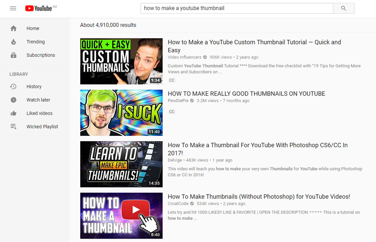
Over time, you will develop your own style for thumbnails. You might even become a video thumbnail maker expert! But for now, don’t be afraid to search YouTube for inspiration.
Even if you know how to create YouTube thumbnails, it can be useful to occasionally check out what other channels are doing. Similar topics will attract similar audiences; by looking at the thumbnails of popular creators, you can see what kinds of thumbnails are being used to attract viewers, and optimize your YouTube thumbnails to compete.
2. Use recognizable faces (particularly your own!)
As humans, we are wired to react to certain signals — and in fact, something as simple as eye contact can make a big difference for your thumbnails.
Studies have shown that making direct eye contact activates the part of the brain that processes emotions and social interactions. In other words, YouTube thumbnails with eye contact are more likely to capture the attention of your audience.
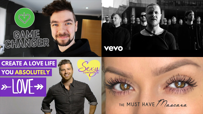
Try including a recognizable face in your thumbnails (especially your own!) to improve brand recognition and draw viewers into your content.
3. Be emotive
Similarly, portraying strong emotions in your thumbnail pictures can be highly beneficial for video engagement. People take emotional cues from each other; showing strong (or even exaggerated) emotions can help viewers to connect with your content.
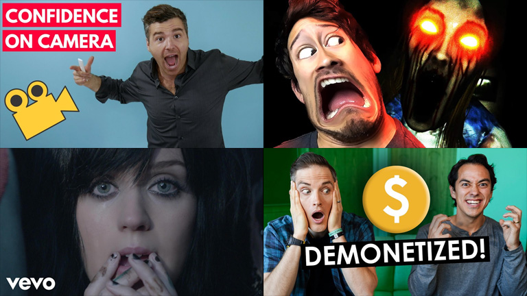
There are different ways to go about this, depending on the video topic. You can try to share your excitement with viewers, make them laugh with exaggerated poses and facial expressions, or give them a glimpse of raw emotion.
The goal is to cause the potential viewer to become emotionally connected with your content — before they’ve even started watching. Knowing how to create YouTube thumbnails with emotional sharpness is a great way to incite curiosity and encourage those click-throughs.
4. Provide clear insight
From the first glance, your thumbnails should be able to provide an accurate interpretation of what your video is about.
By making a customized thumbnail, we can ensure we are offering viewers an honest “sneak peek” into the video (while also utilizing all the right tactics to get noticed).
Here’s an example. Say you searched YouTube for “how to make a unicorn cake”.

The image on the left is the thumbnail for the first video that appeared in the search. The image on the right is a random screenshot taken from that same video — the type of thumbnail that YouTube might provide you as an auto-generated option.
Let’s be honest: the left image is much more compelling.
Making a custom thumbnail has allowed this YouTube creator to paint a visually appealing and informative picture for her video. It clearly promotes the finished product, it provides an honest portrayal of the video, and it lets potential viewers know what they can expect.
Some video creators may be tempted to take the easy way out and use an auto-thumbnail. But as this example shows, a customized thumbnail is much more effective at attracting attention. Knowing how to create YouTube thumbnails will essentially allow you to build a billboard for your video, which can use clean imagery, bright backdrops, text, and other helpful tricks to earn those click-throughs.
And because your thumbnail is representative of the actual content, the people who click your video are more likely to stick around, giving your video a greater retention rate.
5. Use color wisely
Color can be an incredibly powerful way to communicate the message or meaning of your video.
Bright colors can stimulate your viewers. Good contrast can make graphics stand out. Different colors can even work on a nonverbal level to convey different values — think about how green is often associated with nature or health, red with aggression or love, yellow with happiness or warmth, and so on.

There are a few different ways that you can use color to enhance your thumbnail pictures:
- A bright background is a surefire way to stand out against YouTube’s white screen. Bright colors in your thumbnail may also help to draw attention away from neighboring videos.
- Try using contrasting colors to make the subject of your thumbnail really pop! A color wheel may help you to identify good complementary and contrasting palettes for your thumbnail design. (Look at the top-left example; green and purple are a great complementary pair!)
- Improve brand recognition by using your brand colors consistently across your video thumbnails.
- Create the right mood for your video content. Look back at the example above. See how the bottom-right thumbnail has opted for darker, moodier shades? Perhaps this look wouldn’t be right for a cheerful love song — but it’s perfect for a medley of “villain” songs.
So when you’re thinking about how to create YouTube thumbnails for your channel, pay attention to color. It can work on both a conscious and a subconscious level to draw viewers into your content.
6. Include text (but use sparingly)
It’s a common question people ask when learning how to create YouTube thumbnails: should I include text in my thumbnail pictures?
As always, this will depend on your business, the sort of content you produce, and the graphics used in the thumbnail. If your thumbnail shows a clear snapshot of the video content, or it contains some really impressive or engaging visuals, you may be able to avoid text.
However, it can be incredibly helpful to add a small amount of clarifying text to your thumbnail. This will help make clear to viewers what they can expect from your video — without even needing to read the title or description.

If you do choose to add text to your YouTube thumbnails, keep these tips in mind:
- Thumbnails appear small in search results, especially on a smartphone. Make sure your text is clearly legible — you don’t want it to be too small, and you don’t want it to blend into the background.
- Don’t write too much. Fewer than six or so words will be ideal.
- Include important keywords. Think about the phrases people might use when searching for videos like yours. Then include those keywords to make your thumbnail “pop”!
When adding text to thumbnails, your goal is to further clarify what the video is about, and how it brings value to the viewer. Try including benefit-driven text to your thumbnails to attract clicks from the right audience.
7. Improve brand awareness
It is critical that you use your branding in your YouTube thumbnails. Consistent use of your branded colors, fonts, logo and style will help your audience to identify the videos as one of yours.
Check out Neil Patel’s YouTube channel as an example:

Neil uses the same shade of orange, the same style of text, and even his own headshot when creating thumbnails. Make no mistake — these videos are clearly his, and he ensures you know it.
Intelligent use of branding and/or the inclusion of your business’s logo will act as a clear signal to viewers, helping them to recognize your content and notice it easily amongst other videos. Plus, it will make your channel appear more professional and organized.
8. Keep it consistent
We’ve already touched on the idea of consistency, but it’s worth repeating. Making your own thumbnails for YouTube will become much easier if you adopt a consistent style.
It’s okay to experiment with a different look (and you’ll probably try a lot of different ideas for your thumbnails when you first get started). But make it your goal to discover a style of thumbnail that you can recreate easily and use to attract viewers.
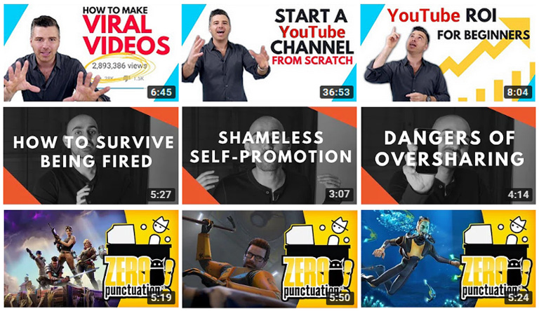
Consistency in color, use of text, layout, logo placement — and while we’re at it, our video upload schedule — can help users to identify your content from among other videos. This can help drive click and views while also building brand recognition. Not to mention that a seamless wall of complementary thumbnails is very easy on the eye!
9. Plan ahead
Take some time to plan out the layout of every element of your thumbnail.
Here’s a useful tip: avoid placing anything too important in the bottom right-hand corner. Why? Because that’s where YouTube positions the timestamp or the “watch later” clock.

Here are some other points to remember:
- Pay attention to the placement of any text. Don’t cover important graphics, and avoid situating text over a similarly colored or busy background.
- Practice restraint. Often, a single visual element with a few concise words will be more effective than a chaotic arrangement of colors and pictures.
- Start planning the thumbnail while you are shooting the footage. Have you ever tried to get a screenshot from a video? The results are almost always out of focus. If you’d like to include a still image from the video in the thumbnail, do yourself a favor — stop during filming and take an actual photograph! Photos will typically produce higher quality results than video stills.
10. Optimize for all devices
Did you know that more than half of your audience will be viewing your channel on a mobile device? When creating YouTube thumbnails, ensure you are optimizing for all devices; check that your pictures and text look great, no matter what size screen they are seen on.
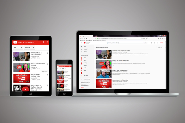
Design for the small screen. Using close-ups can be a good idea, and (as mentioned earlier), try to include as few words as possible. On some mobile devices, viewers may have difficulty seeing the title or description of your videos, so the inclusion of large, legible, keyword-based text in the thumbnail may become crucial.
Whenever possible, get your hands on a variety of devices to check your thumbnail design and ensure that it makes an impression on any scale. If not, make a change!
Making YouTube Thumbnails is a constant work in progress
A big part of learning how to create YouTube thumbnails is simply trial and error. When you start making YouTube videos, you should experiment with different thumbnail styles, monitor the results, and find what works for your brand.
There are a few ways that you can analyze and improve the effectiveness of your thumbnails:
- Head to YouTube Analytics to see useful data about your videos.
- Retention rate may be a good indication of how well-suited your thumbnails are to the videos. In some cases, a low retention rate may mean that the thumbnail is successfully compelling users to click the video, but viewers are then finding the content unsuitable. You don’t want people to leave your videos before the end; this can affect your rankings!
- Study videos with high audience retention rates to interpret how you can replicate the success of their thumbnails and/or titles.
- Experiment with small changes, and monitor what happens. When you achieve positive results, you’ll be able to better understand what worked.
- Remember that these insights will not be indicative of the performance of the video thumbnails alone. Data will also be affected by the video’s title, description, and other elements that contribute to YouTube’s search algorithm.
Experiment with your thumbnails and test the results. Tips like the ones I’ve covered in this article can provide some good guidelines for a thumbnail template — but different thumbnails will work for different people. Some rules were made to be broken! Utilize key principles, but feel free to branch out and get creative.
Free Tools to Create Great YouTube Thumbnails
Are you looking for a YouTube thumbnail generator so you can start attracting more views? Perhaps you’re wondering how to make YouTube thumbnails without PhotoShop? With the various graphic design tools that are available online, it’s easy! You’ll love these free online YouTube thumbnail makers.
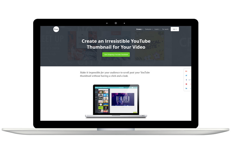
Canva
Canva is a free and easy to use graphic design tool that will allow you to generate YouTube thumbnails in no time. If you aren’t confident in your design skills, Canva is perfect. Simply choose from their range of free or optional paid YouTube thumbnail templates. Then, using its user-friendly drag-and-drop system, you can customize the images, text, fonts, colors, filters, and much more to create your perfect thumbnail.
Create your free Canva account here. And don’t forget to watch the video at the start of this article for a full tutorial on how to use Canva to make YouTube thumbnails!
Adobe Spark
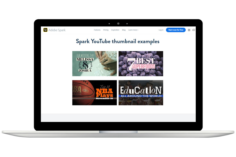
You can easily learn how to create YouTube thumbnails with Adobe Spark. Their Inspiration Gallery is a great place to find ideas that match your video content and overall channel.
Adobe Spark offers step-by-step design. Choose the YouTube Thumbnail template, pick your favorite theme, upload an image or select a photo from the gallery, and optimize with their broad set of typography choices.
Sign up to Adobe Spark for free here.
Snappa
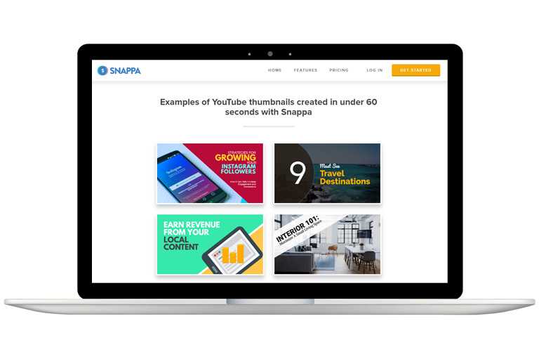
Snappa is a free thumbnail maker that provides a user-friendly graphic editor for a variety of purposes. With Snappa, you can make YouTube thumbnails, social media posts, infographics and other visual marketing graphics.
Snappa does have two account options that require you to pay a monthly charge in order to access unlimited downloads, the full library of templates, and the ability to upload custom fonts. However, the free Starter account offers tools and usability that should suffice for most content creators.
Bonus option: PicMonkey
One final YouTube thumbnail maker worth mentioning is PicMonkey. It’s not free (sorry about that!), but it offers a wide range of filters and effects to help you create professional thumbnails in mere minutes.
Arguably, PicMonkey has a steeper learning curve than other options like Canva. However, if you’re willing to learn the different graphic design editing tools, you may find that PicMonkey provides greater functionality to help you create thumbnails that capture attention.

Conclusion
One of the greatest ways to get your videos seen is by giving each of them an irresistible thumbnail.
Knowing how to create YouTube thumbnails is a big part of setting up a successful channel on YouTube. Whether you’re a whiz on Photoshop or you’re keen to try thumbnail generators like Canva, creating custom thumbnail pictures is something every YouTuber should learn.
When done well, your YouTube thumbnail could help you to gain more views, attract new subscribers, and grow your channel. Make it impossible to scroll past your videos by making thumbnails that capture the eye and speak volumes about your content!
If you want to learn more about making thumbnails or growing your business on YouTube, sign up for my FREE training at Viewership.
Got some design tips for YouTube thumbnails? Share them in the comments below.
What is your Youtube channel?
This was Really Amazing, Adam Lodolce sir And I Think you Have The Best Info About Thumbnails