What do people see when they visit your YouTube channel? A generic, boring ol’ piece of channel art? Or a stunning, informative banner that engages everyone who sees it? With the right YouTube channel art template, you can achieve the latter and start compelling the world to watch your videos.
Whether you’ve just started a YouTube channel or you’re looking for ways to get more subscribers, the importance of a good channel banner cannot be overlooked.
In this article, I’m going to teach you how to make YouTube channel art that promotes your business, grows your brand, and entices viewers to watch your stuff. Stick around!
YouTube Channel Art Template: 4 Critical Components You Need To Include In Your Banner
Your channel art is the YouTube equivalent of a Facebook cover image. It is the banner artwork that appears at the top of your channel — and as such, it is one of the first things a visitor will see when they arrive at your page.
Your YouTube channel art is your billboard, your messaging, and your branding. It is your way of telling the YouTube community who you are, what you do, and why they should be watching your videos.
A lot of people are, understandably, not quite sure how to make YouTube channel art when they are first starting out. What should you put up there? A photo of yourself? A pretty stock image? Your logo? It can all seem quite confusing, especially when you’d prefer to be focussing on making videos.
When our clients start working with Viewership, your YouTube channel artwork is one of the first things we look at. When you get your channel art right, you can dramatically alter the appearance and appeal of your channel, and give your visitors a sense for the value you can bring to them.
Why you MUST create Channel Art for your YouTube Channel
When someone discovers and enjoys your videos, the natural next step for most people will be to click your link and visit your channel. What will they find? If you haven’t uploaded any channel art, visitors may assume you are unprofessional, inexperienced, or you just don’t care. People can be equally dissuaded if the artwork you’ve uploaded is lacking in good design and strong branding.
Creating a compelling appearance for your channel with an optimized YouTube channel art template can help to entice users to watch your content and subscribe to you.
Banner art, when done well, can create a great first impression for your channel. You can capture your viewer’s attention, create a visual representation of your business, and tell visitors what they can expect from you in the future.
It doesn’t matter whether you are a business owner, a musician, a comedian, a video gamer, or any other type of content creator. By personalizing your profile with channel art, you can communicate who you are as a brand, and stand out from the crowd.
What is the size of a YouTube banner?
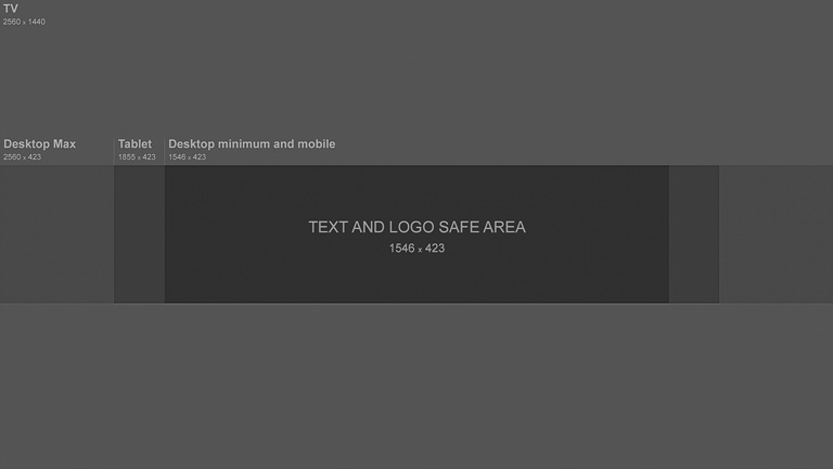
Your YouTube channel art will look best when uploaded as a 2560 x 1440 px image. The minimum dimensions for upload are 2048 x 1152 px.
Meanwhile, the text and logo “safe-area” of your cover art is the 1546 x 423 pixel space in the middle. In other words, if your image is larger than this, or you place important assets outside of this safe area, it is at risk of being cropped on certain views or devices.
Using a professional YouTube channel art template will help you to create a banner within the right recommendations. YouTube provides its own YouTube channel art template to help you figure out the perfect layout. Here’s a visual representation of those dimensions:
Here are some more YouTube channel art tips to help guide you:
- Use a high-resolution image. A blurry banner won’t work well to promote your awesome content! But be careful not to exceed 6MB.
- Always remain aware of the safe area of your channel art. Place the most important elements in the center and build your banner from the middle out using the right YouTube banner size.
- Another vital reason to centralize images, logos and text is to keep them clear of YouTube’s default overlays. Namely, your channel icon (in the top-left corner) and your social sharing buttons (in the bottom-right) could obscure other parts of your channel artwork and hinder your marketing efforts.
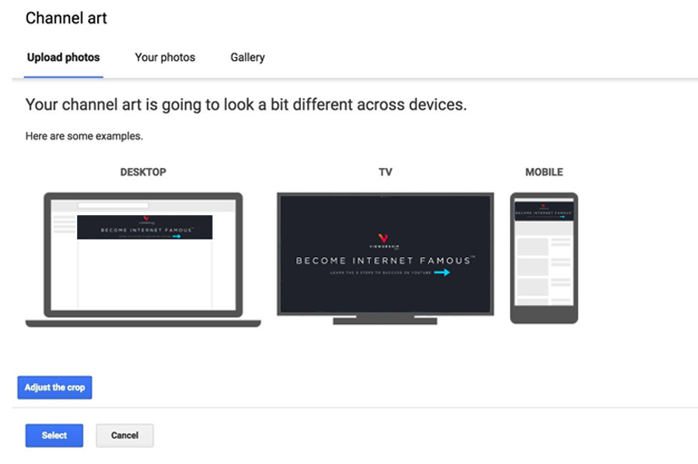
- Consider how your channel art will look on all devices — computers, tablets, mobiles, and televisions. Not to worry; YouTube makes this easy by showing you a preview of your channel art.
4 essential YouTube Channel Art components you cannot leave out
If you’re a YouTuber who wants to grow your business on YouTube but aren’t sure how to get started making a YouTube banner for your channel, you should check out a YouTube channel art maker like Adobe Spark or Canva. These online DIY design tools make it super easy to create eye-catching banners, even if you don’t have graphic design experience.
Personally, I use Canva. It’s a fantastic website you can use to design YouTube channel art, video thumbnails, social media images, posters and much more. Plus, it has a user-friendly drag-and-drop design system that anyone can use, so you can soon be creating epic art for your YouTube channel.
All you need to do is choose from Canva’s massive library of YouTube channel art templates. Select your favorite layout, and customize the images, text, fonts, and colors as necessary. Canva will help you give your channel that professional, personalized edge!
Ready to get started? Here are the four critical things you should include in your YouTube channel art:
1. Headline
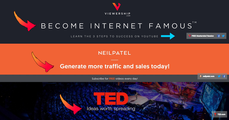
If you’ve ever read anything about online marketing and selling things online, you’ll know about the importance of headlines. Any good YouTube channel art template should include the placement of a headline, especially when you are growing your business on YouTube.
A headline is a critical part of your sales message. When used as part of your YouTube channel art template, it should make an impression on visitors and ideally motivate them to check out your content.
Viewership’s headline, for instance, is “Become Internet Famous”. Your headline doesn’t need to be long; around 3 to 10 words is ideal. The goal is to create a tagline that concisely conveys to viewers who you are. It should be unique to your channel. And, most importantly, it should clarify the value your content brings to your audience.
What can viewers hope to achieve by watching your videos? Answer that question with a well-written headline.
Not sure how to write compelling headlines for your YouTube banner? Using the AIDA system (attention – interest – desire – action) may help you brainstorm ideas.
- Attention — You have a limited window in which to capture attention. Make sure the headline is clearly visible in your channel art.
- Interest — Consider using intrigue, humor, unusual phrasing or empathetic language to write a headline that makes viewers interested to know more.
- Desire — Your headline should put forward a desirable end-goal for viewers. Are you passionate about your YouTube channel? Write a headline that shares your enthusiasm!
- Action — Try prompting action with power verbs like “become”, “generate”, “discover” and so on. Compel people to take that next step and engage with your channel!
2. Posting Schedule
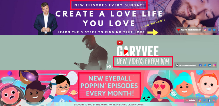
When do you upload new video content? Every day? Once a week? Twice a month? Include a posting schedule in your channel banner to tell your audience when they can expect to see new content from you.
Establishing a consistent upload schedule is an important part of growing your viewership and monetizing your YouTube channel. If you are new to YouTube and are still learning how to produce videos, you may not have a set posting schedule. That’s ok. And of course, some YouTubers (such as vloggers) don’t stick to an ongoing calendar, but rather upload spontaneously when the mood strikes them. That’s ok, too.
But for business owners, providing your viewers with new videos on a set schedule will reflect positively on your channel. Make it a priority to establish your upload schedule so you can show your audience that you are a reliable, authoritative, professional resource on YouTube.
Of course, you should avoid adding a posting schedule to your banner until you have created a consistent rhythm of content creation. You don’t want to confuse or mislead your potential subscribers by promising weekly videos but failing to deliver.
Once you feel confident in your posting schedule, add it to your YouTube channel art template and tell the world when your next video will appear!
3. Call To Action
Another critical component of your YouTube channel art — and a crucial step in all of your YouTube marketing — is the use of calls-to-action.
Calls-to-action, or CTAs, are images, buttons, text or other prompts that prompt action from your viewers. For those of you just starting out on YouTube, the most positive and desired effect is probably going to be for viewers to subscribe or visit your website.
Your YouTube channel art template can help you with this! By simply adding text and links, you can compel your audience to perform a task and improve your conversion rates.
Add Text:
Ideally, your headline should already be working actively to encourage viewers to click that “subscribe” button. But you can also use additional text to clarify to visitors why they should engage with your brand, and what they stand to gain from you.
Take another look at the Viewership YouTube banner:

In addition to the headline, the Viewership channel artwork uses text (“Learn the 3 steps to success on YouTube”) to make clear the value of engaging with my business, and the next available step that interested viewers can take.
Add Links:
You’ll notice that my CTA text is directly interacting with the links on my YouTube channel art template. These links are a great way to provide viewers with immediate access to your other marketing channels.
Adding links to your channel art is easy:
- Go to your channel homepage. Select “Customize channel” and click the “cog” icon beneath your channel art.

- “Channel Settings” will appear. Enable the “Customize the layout of your channel” option.
- Click “Save” and head back to your channel homepage.
- Now that customizations have been enabled, you can find the “Edit links” option in the top right corner of your channel art.
- Click “Edit links” to be taken to the “About” page.
- Add links and choose how many will appear on your channel art.
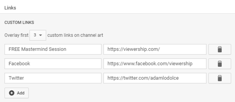
You can add links to your website, email address, social media networks and other sites. The more opportunities your audience has to connect with you, the better! Include CTA text and links in your YouTube channel art template to prompt viewers to follow your brand and become active subscribers.
4. Branding
Colors, logos, fonts, style — the use of consistent brand imagery is crucial in helping people to recognize your channel and your videos.
When working with a YouTube channel art template, try to keep your design on-brand. You needn’t make it a carbon copy of your logo, nor should you transplant your Facebook cover over to your YouTube banner.
Instead, use your branded colors, fonts, keywords and so on to create a channel artwork that is intrinsically you.
Check out these examples from two well-known brands:
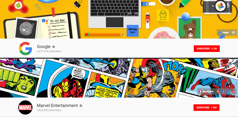
Sure, these globally-recognized brands are in a league of their own. They don’t need to rely on a well-designed channel banner to attract new subscribers. (Lucky them!) Nevertheless, these are some excellent examples of how you can use your brand identity to inform the design of your channel artwork.
Here are some quick branding tips for you:
- Use color consistently — When designing your YouTube channel art template, be sure to use the same colors that feature in your other branding materials. Consistency is king!
- Make it match your business — Incorporate your logo and industry-specific imagery to your YouTube channel art to help distinguish your brand. After all, people are better programmed to respond to visual content.
- Use your own face — Do you feature frequently in your videos? If you are the face of your channel, own it! Consider adding a photo of yourself to your YouTube artwork to make your channel instantly recognizable, and give your profile a personable, approachable appearance.
- Carry your brand across your video thumbnails — Another good idea to strengthen brand awareness is to use these same design ideas for your video thumbnails. This results in a sleek look for your page; just look at the Backlinko channel:
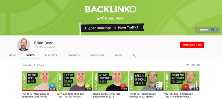
Allow people to see the consistency of your brand in your channel art and your content. Make it so that they recognize your videos in search results and recommended lists — and they’re excited to see it’s you!
Ready to make your own channel art? Click here to see how you can easily include the four above-mentioned critical components using my YouTube channel art template on Canva. Or click here to customize one of Canva’s many other channel art templates.
And don’t forget to watch that video up top to see how it’s done!
How to upload your YouTube channel art
Have you made your perfect piece of channel art? It’s time to upload your new banner and start impressing new subscribers. Here’s how to add channel art to your YouTube profile:
- From the YouTube homepage, click your profile icon in the top right corner.
- Go to “My channel”.
- Select “Customize channel”.
- Select “Add channel art”.

- Select “Upload photo”.
- Adjust the crop of your image as necessary to ensure it looks perfect on all devices.
- Once you are ready, click “Select”.
And… voilà! Your YouTube channel is now the proud owner of a custom piece of channel art. You are ready to engage viewers, improve brand awareness, and drive people to subscribe for more.
Conclusion
An engaging, high quality YouTube banner can do wonders for the success of your YouTube channel. Thanks to YouTube channel art makers like Canva, it’s easier than ever to create well-designed banners that promote your business and add a splash of personality to your content.
But if you need a helping hand with your banner — or any other part of YouTube — Viewership is here to help. I can teach you the tips and techniques to succeed on YouTube and grow your business!
Here’s one final thing to keep in mind: it’s okay to change your channel art every now and again! In fact, updating your banner can be a great way to advertise new products or promotions, or share the latest updates about your business. It also shows your subscribers that you are an active and modern presence on YouTube. Just be sure that you only change your channel art for a good reason. And, of course, keep using the best practices to ensure your new banner is even better than the last.
Do you have your own YouTube channel art template? Got any tips to create bangin’ banners? Let me know in the comments!
[…] colors, fonts, etc.) appear consistently across your channel. This includes your YouTube icon, channel art, and video thumbnails, as well as your website, social media profiles and other marketing […]